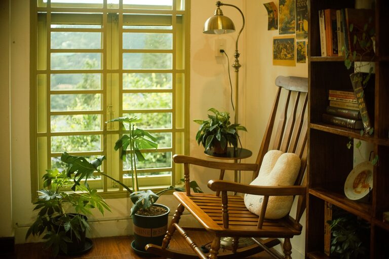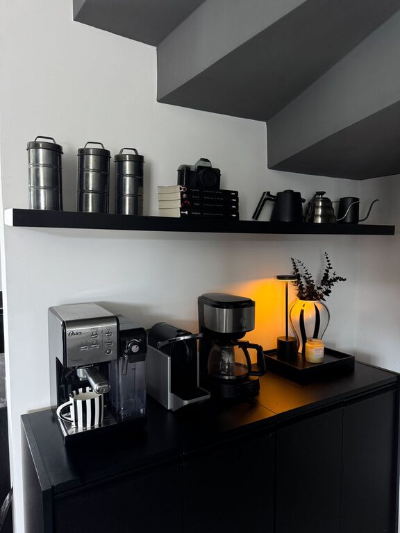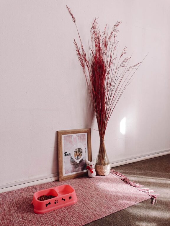







Creating a soothing and peaceful environment at home often starts with the colors you choose for your walls, furniture, and accessories. Calm colors can help reduce stress, promote relaxation, and make your living space feel more welcoming. Whether you are redecorating an entire room or just refreshing a small area, selecting the right calm colors can make a big difference.
In this guide, we’ll explore practical tips for choosing calm colors that suit your style and space, helping you create a serene home atmosphere.
Why Choose Calm Colors?
Calm colors are typically soft, muted shades that evoke a sense of tranquility and balance. They help to:
– Reduce visual clutter and overstimulation
– Promote a relaxing mood and restful environment
– Coordinate easily with various decor styles
– Make spaces feel more open and airy
Common calm colors include soft blues, gentle greens, warm neutrals, and light grays. These shades tend to be easy on the eyes and pair well with natural materials and textures.
Tips for Choosing Calm Colors for Your Home
1. Consider the Mood You Want to Create
Start by thinking about how you want to feel in the space. For example:
– Bedrooms: Soft blues or lavender can create a restful atmosphere.
– Living rooms: Warm neutrals and gentle greens can encourage relaxation and socializing.
– Bathrooms: Cool tones like pale aqua or light gray promote a spa-like feeling.
– Kitchens: Subtle creams or muted sage can bring calm without sacrificing energy.
Matching the color to the room’s purpose will ensure the space supports your daily activities.
2. Test Colors in Different Lighting
Lighting plays a big role in how colors appear:
– Natural daylight can make colors look brighter and cooler.
– Incandescent or warm lights can add warmth, making cool colors feel softer.
– Fluorescent lighting may give colors a harsher or more clinical look.
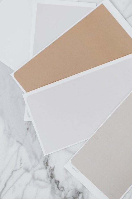
To avoid surprises, test paint samples on your walls and observe them in morning, afternoon, and evening light. This helps ensure the chosen color maintains a calm feeling throughout the day.
3. Use Neutral Colors as a Base
Neutral shades like beige, ivory, soft gray, or taupe provide a versatile foundation. They are naturally calming and allow you to add accent colors through furniture, pillows, or artwork.
Neutrals also reflect light well and make rooms feel spacious and balanced. If you prefer color, try pairing neutrals with subtle pastel tones or earth-inspired hues.
4. Choose Matte or Satin Finishes
Glossy or high-sheen finishes can reflect light sharply and feel more stimulating. For calmness, opt for matte or satin paint finishes. These finishes absorb light gently and create a soft texture, enhancing the room’s peaceful vibe.
5. Incorporate Nature-Inspired Tones
Colors found in nature often feel soothing. Think of:
– Sky blues
– Soft greens from leaves or moss
– Earthy browns and tans
– Light sandy beiges
Bringing these hues indoors can connect your space with the outdoors, which is naturally calming to many people.
6. Balance Colors with White or Light Accents
White or very light colors can brighten a room and serve as contrast without creating harshness. Using white trim, ceilings, or furniture can balance calm colors and add freshness to the space.
7. Avoid Overly Bright or Dark Shades
Very bright colors like neon or bold reds can be energizing but may disrupt a calm atmosphere. Similarly, very dark colors might feel heavy or confining.
Stick to softer, muted tones to maintain peace and harmony.
8. Consider Your Personal Preferences
Ultimately, choose colors you enjoy and feel comfortable with. Calm colors don’t have to be dull or boring—there are many beautiful shades to explore. If you love a particular hue, look for its softer or greyer variations to keep it relaxing but personalized.
How to Apply Calm Colors Throughout Your Home
Layer Colors in Different Elements
Don’t limit calm colors to just walls. Use them in:
– Upholstery and cushions
– Curtains and rugs
– Decorative accessories like vases or lamps
Layering calm tones in various textures adds depth without overwhelming the senses.
Use Color Palettes
A simple palette of 2–3 calm colors plus neutrals creates a cohesive look. For example, pair a soft blue wall with light gray furniture and cream accents.
Create Feature Walls
If you want to introduce calm colors without fully committing, paint one wall in a calming shade as a focal point. This adds color interest while keeping the overall space soothing.
Final Thoughts
Choosing calm colors is a wonderful way to enhance the comfort and serenity of your home. By keeping your room’s function in mind, testing colors under different lights, and layering nature-inspired hues with neutrals, you can create relaxing spaces that you’ll love spending time in.
Remember: the best calm color is one that feels right to you. Take your time experimenting with shades, and enjoy the process of transforming your home into a peaceful retreat.